Group Members:
Kushi Sanjay Kumbagowdana, Mia Linh Nguyen, Tiffini Thi Tran, Marionette Quey Umali, Hamilton Ko
Overview
Our team explored different websites when stumbling upon the Zara website which was difficult to navigate through and was not accessible. With so many issues present, we made an attempt to redesign the website to be more accessible.
Background
Before we started brainstorming ideas and coming up with new designs, we had to go through the current Zara website and see what issues consistently appeared and record them to see what we might want to tackle.
Some of the major issues that we consistently came across was text being too small to read without having to zoom into the page, the navigation bar continuing to appear at the top of the page even as the user scrolls down, causing it to overlap on top of the product images, and each clothing section as well as clothing department having completely different layouts which made the shopping experience confusing due to being shown either multiple products in a grid or giant photos and videos of the clothing being worn by models.
The one issue that we encountered that shocked us the most was there being an accessiblity button with a multitude of options to help increase the text or contrast, use voice commands, and adjust screen readers but almost none of these options working or working in the way that it is intended.
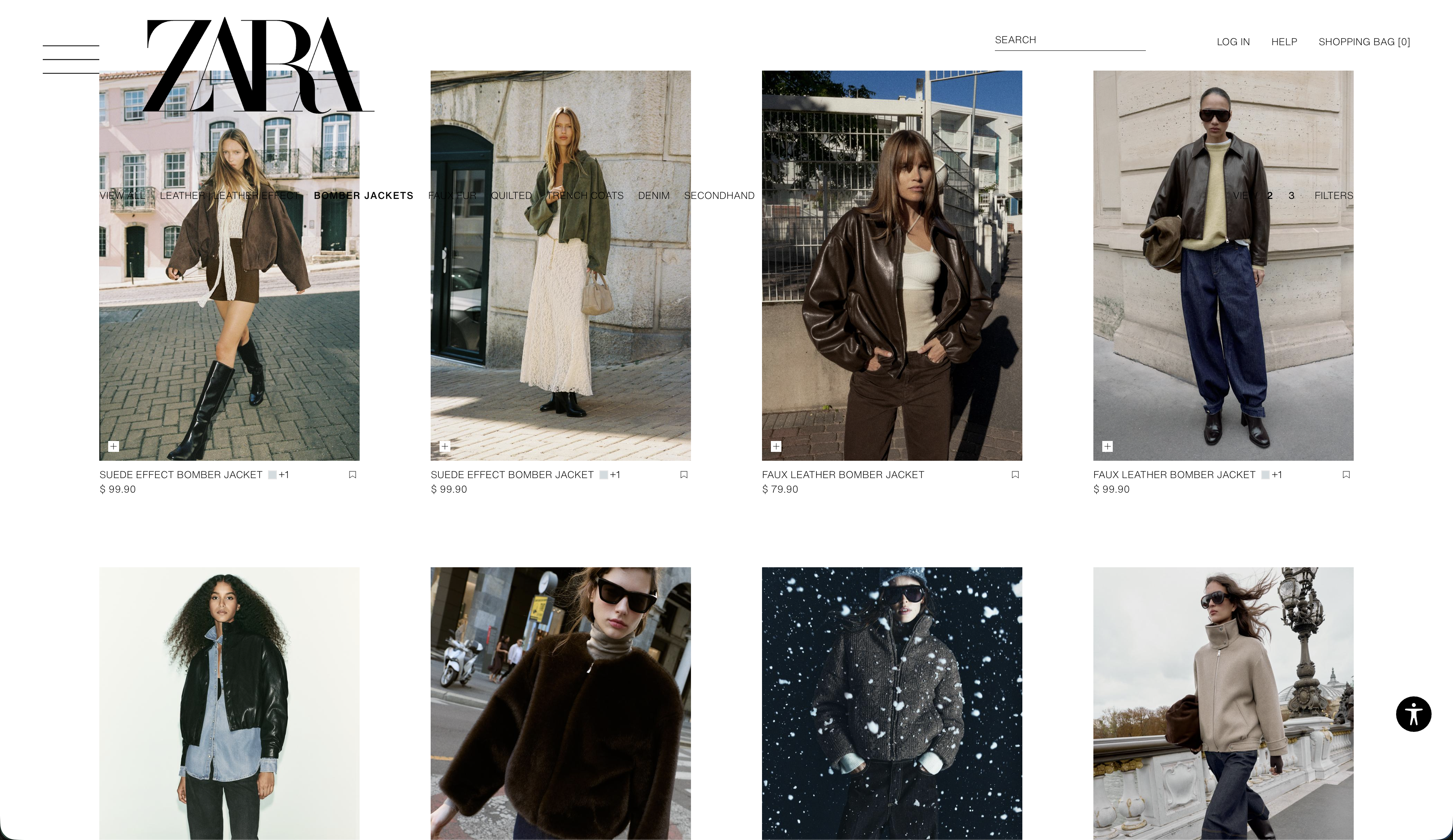 The navigation text is small and overlaps images
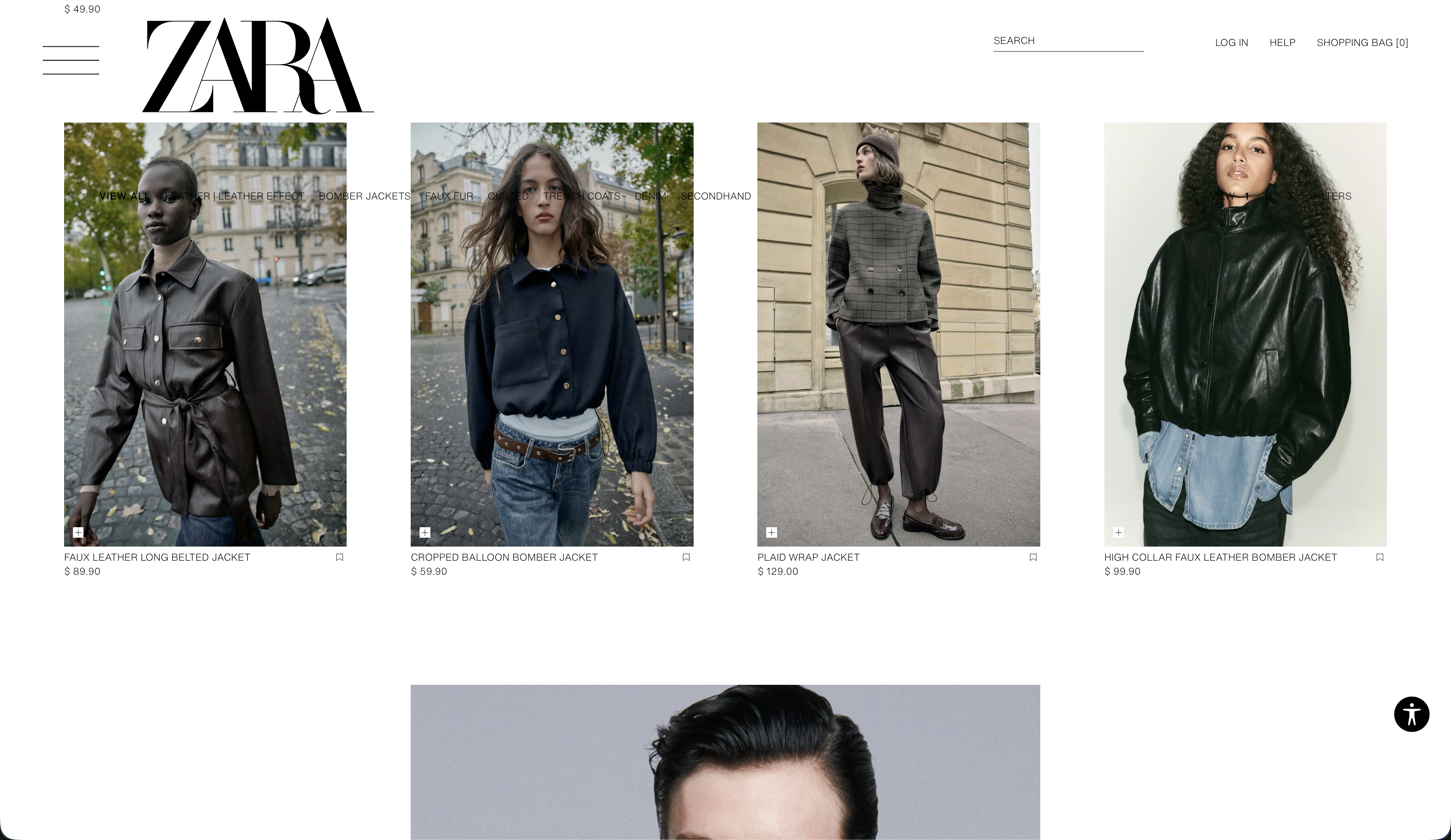 Image layout is different from previous section
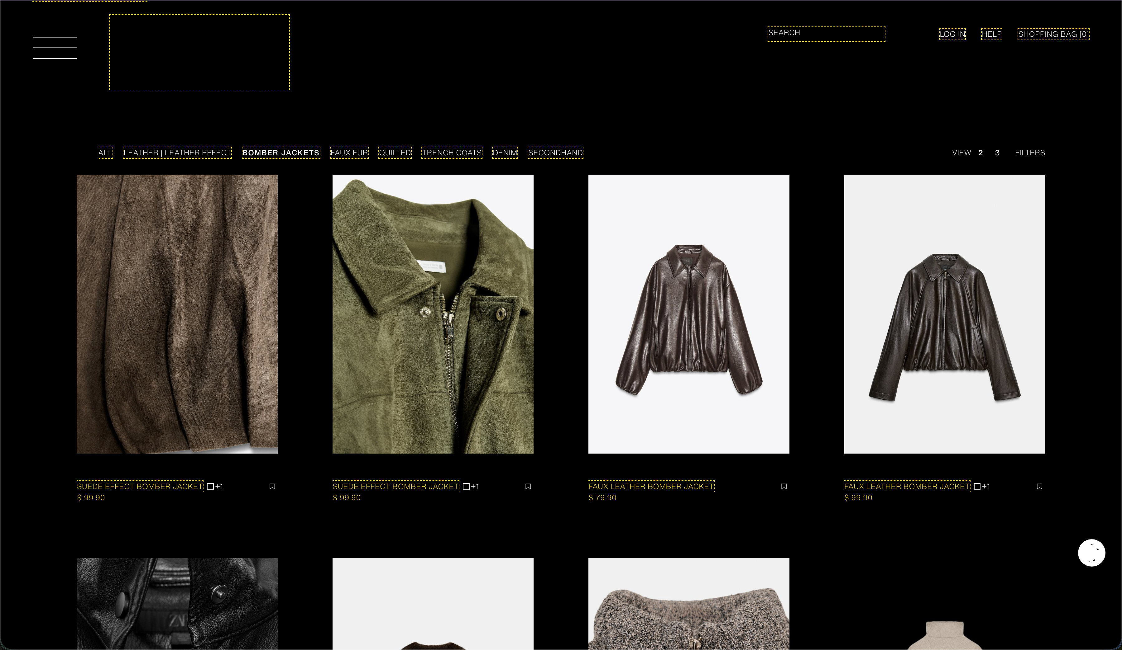 Contrast option doesn't show logo and is difficult to view overall
Problem Statement, Concept, and Framework
Our first steps were to determine what features and options that we were going to be altering or incorporating in our redesign to improve the overall shopping experience while also maintaining the brand's image. To accomplish this, we determined to use Next.js as our framework as it had benefits such as image optimization, fast loading speeds, and internalization support which all seemed to align with what would be required for an e-commerce website like Zara. The full document can be viewed here.
Evaluations and Prototype
Once we determined our framework and the design issues that we wanted to address in our redesign, we each began making wireframes to see which design elements that we liked and wanted to pursue. Each of our designs focused on making it easier for the user to view the product and be able to read the product name along with the sizes available. The layout of the website was also made to be consistent between different pages to ensure that users are not confused as they switch between different categories. We interviewed users using our wireframes and the original website to evaluate what designs best suited what the typical user might be expecting. We then took these results and created a prototype.
Presentation
The presentation slides can be found here.
If video can't be played, click here to view the project demo.